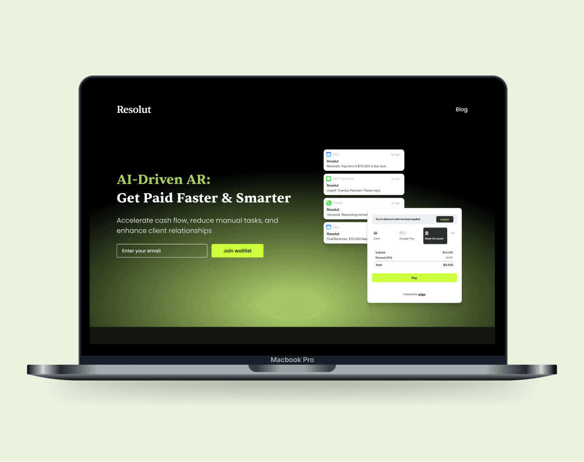
Resolut
PRODUCT DESIGN
SOCIAL IMPACT
2024
TIMELINE
February - March, 2025
TEAM
1 Design Lead, 2 Designer
ROLE
Web & Brand Designer
SKILLS
Figma, User Research, Workshop Facilitation
Overview
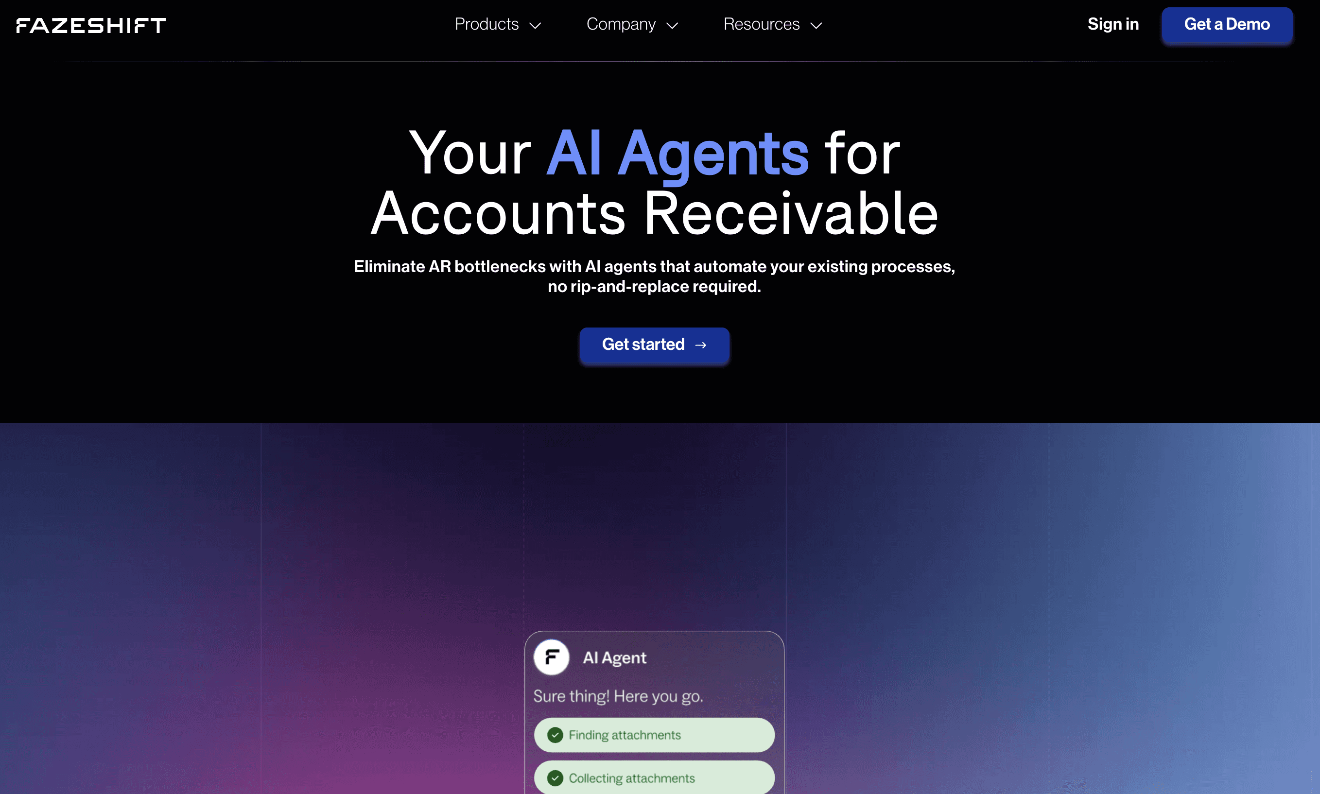
Resolut came to Kinsdesign with no brand, no identity, and no landing page — just a product that helps businesses stop chasing payments. Our job was to make an AI-driven accounts receivable platform feel credible enough to sit in front of a CFO.
I was the Figma designer on the project, responsible for the landing page layout, scroll animations, and micro interactions. A teammate handled brand identity and the Framer build.
The design challenge
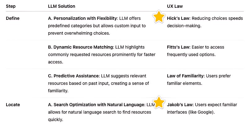
Frontline workers operate in high-pressure, time-sensitive environments and rely on databases like 211 Ontario, which are rich in information but difficult to navigate.
Scope of Work
Discovery & Framing
Facilitated workshops, conducted interviews, and translated insights into JTBD opportunities.
Rapid Product Design
Turned ideas into a quick prototype, then refined them into mid-fidelity flows and screens.
AI & Brand Direction
Designed the AI prompt builder while shaping the visual identity and overall product feel.
RESEARCH
Reference
James described a typical search: open 211, type something broad, scan 40 results, open tabs, cross-reference a binder, call a number that's been disconnected. The problem wasn't missing information. It was that getting to the right information required expertise most workers hadn't built yet.
IDEATION
Reframing around intent, not features
Workers weren't failing at searching. They were failing at asking. One statement anchored the whole design direction:
"When I'm with someone in crisis, I need to find the right resource in under two minutes, without knowing the correct keywords in advance."
That ruled out a traditional search box entirely.
What we tested first, and what failed
Using the JTBD statements, I translated key problems into “How Might We” questions and ran Crazy 8s to rapidly explore interaction patterns and prompt structures grounded in real user needs.
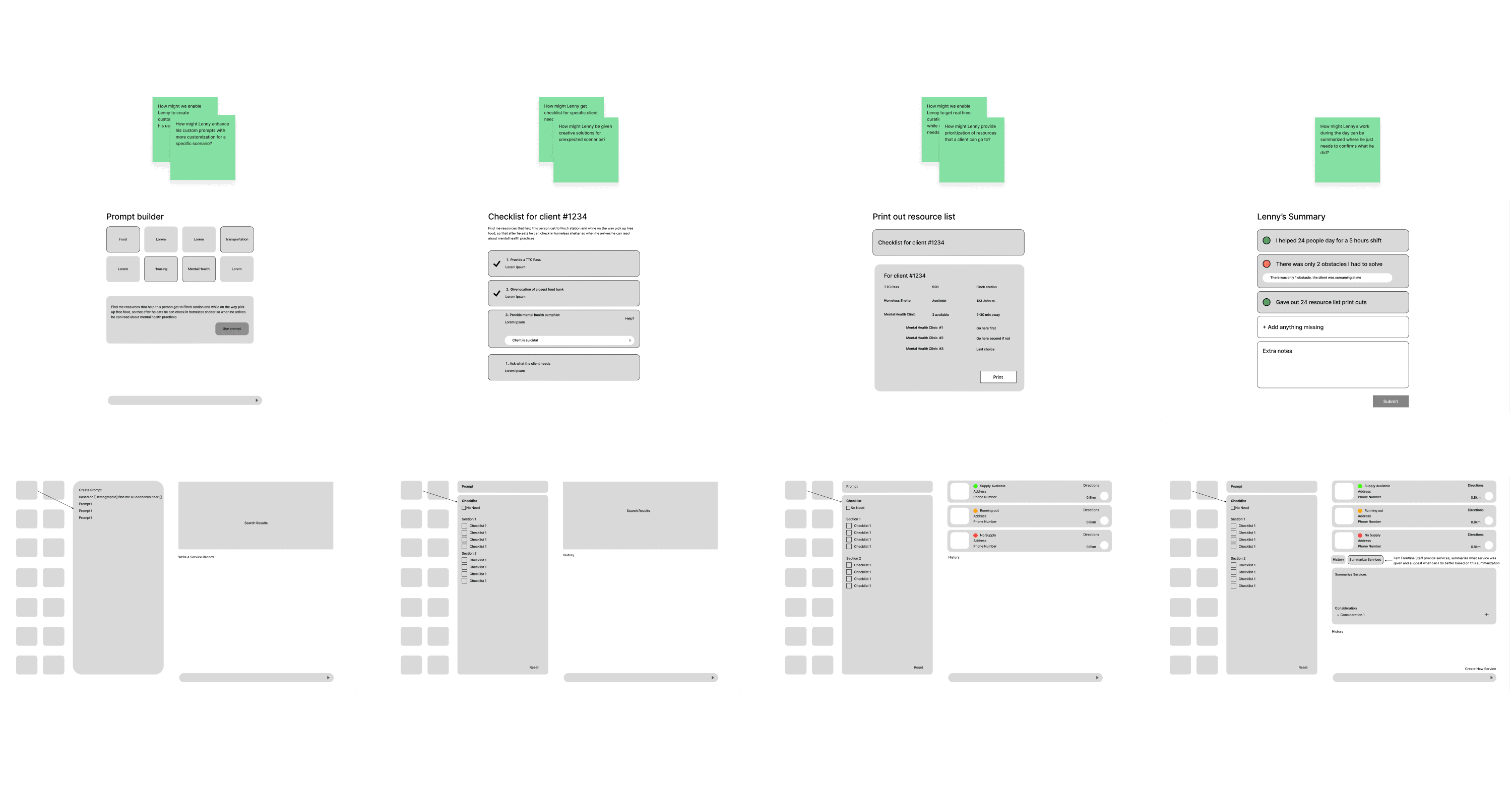
Iteration into mid-fidelity concepts
From rapid prototyping, I turned the concept into clearer flows and screens, using structured prompts and guided inputs to reduce friction, lower cognitive load, and help users reach relevant results faster.
FINAL DESIGN
Flown Away
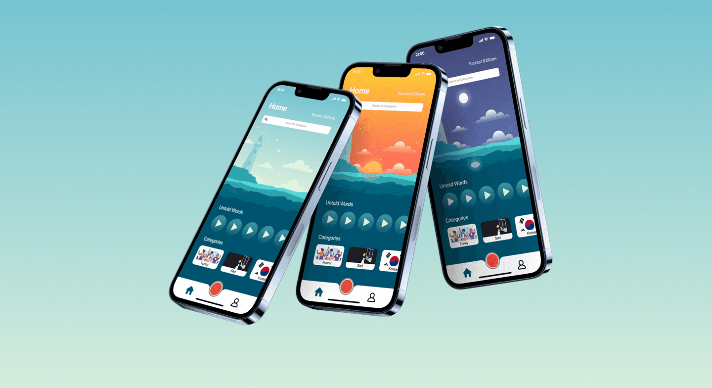
After 30 days, every recording disappears. Users who shared something receive a notification with an animation of their story flying away to the Pacific Ocean. Most apps treat deletion as a settings option. Untold Words treats it as part of the experience — leaving something behind should feel like a choice, not an accident.
Flown Away
After 30 days, every recording disappears. Users who shared something receive a notification with an animation of their story flying away to the Pacific Ocean. Most apps treat deletion as a settings option. Untold Words treats it as part of the experience — leaving something behind should feel like a choice, not an accident.
The outcome
The landing page went live at resolutai.com. Since launch, Resolut has secured two pilot customers including a top five financial institution in the United States and the largest fractional CFO network in the world, and is actively booking investor meetings.
A landing page contributed to deals at that level. That is the clearest signal that the design did its job.
What I'd do differently
Empathetic Adoption
Nonprofit teams adopt tools that feel built for them, not pitched at them. Trust had to come before behaviour change.
Better Questions Matter
Asking "when does this go wrong?" gave us a different problem to solve than "what do you want?" That shift changed everything we designed.
Think by Writing
Designing for crisis contexts meant one constant pressure-test: would this hold up at 4pm on a Friday when someone is exhausted? That question drove most interaction decisions.